UAO Design
UAO moved its office from the riverside to a single small building in the Liangyou Hongfang art community in Wuhan; the predecessor of the Liangyou Hongfang art community of was the supporting factory of Wuhan meat joint factory in 1960s – bristle factory and feather factory., and the buildings in the factory are old industrial buildings with production properties. UAO is responsible for the landscape design of the plant area, as well as the core architecture: the architecture and interior design of ADC art design center.
Continuation: design from the perspective of planning and landscape
Liangyou Hongfang art community, formerly known as Wuhan bristle factory and feather factory, was used as a building material market in the 1990s. With the development of the city, the building material market is also declining. Due to the change of the use function, the buildings in the factory are built in different years, including the red brick single-storey wood truss tile roof factory in the 1960s, and the multi-storey brick concrete structure factory in the 1980s with terrazzo on the outer surface. There are also buildings with exterior tiles or small mosaics in the 1990s; the overall planning of Shanghai Shuishi keeps the basic structure of the original small building, with exterior materials, so that historical traces can be expressed and continued from different architectural forms;
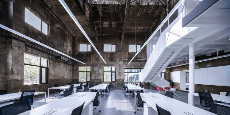
In the process of design, it is found that there is a single small building with a high void in the core area of the plant, which is located next to the tall red brick chimney and water tower. The former is the distribution motor room of the industrial plant. The towering interior space, the sun pouring down from the skylight on the top and the window on the mezzanine, is shining on the smoky and burning old wall, which is full of historical traces, with a strong sense of space; the founder and chief architect of UAO, Li Tao, decides to rent it as his own office space.
Towering: carry forward the characteristics of the original space
The original generator room has a total height of 8 meters, The towering space like a church is very shocking. The original starting point of the design is to retain and carry forward the high-rise space sense, so the new design is very restrained, only a small space volume is implanted into the large space, and the final decision is to rely on the original two-story side to design a new column span width mezzanine to retain most of the vertical of the hall. The spatial pattern makes this new implant not only not change the original characteristics of the space, but also let the sunlight pour out and fill the whole space; moreover, its shape strengthens the characteristics of the towering Space and gives an intuitive scale to the viewer.
The purpose of designing the mezzanine on one side also makes the sense of sequence of the long axis obtained by the skylight retained. The mezzanine is only supported by a 200mm diameter column in the middle, and the folding staircase strengthens the weight and floating sense of the mezzanine. It strengthens the independent supporting function of the structure through the expression of the building, similar to the column in the center of Xiaoyuan’s White House. The light and ingenious central column contrasts with the thick and historic wall around – the new volume is reflected by pure white. , the old wall is only painted with curing agent after cleaning, which keeps the original trace of smoke, fire and even dirt, thus creating a new dialogue and contrast with the old. This kind of “dirty” is also the characteristics and history of the original space. The white volume extends to steel bookshelves, cabinets and tables, and the hall is decorated with a small amount of red furniture.
Function: service and served space
In determining the form and location of the mezzanine, at the same time, the use function of UAO is combed. Combined with UAO’s working process and mode over the years, our office functions are divided into three parts: Office + supporting services + exhibition forum. The office includes two partners’ offices and office halls; supporting services include: model room, printing room, meeting room and finance room, as well as tearoom and restroom, while exhibition forum needs a clean and tidy large space;
According to the functional requirements and the current situation of the building, the high-rise area is taken as the office area, the lower area in the south is taken as the supporting service space, and the east side of the high-rise space is originally a two-story space, the first floor is for the front hall and exhibition, the second floor is for the conference and forum, and the second floor is the roof of the supporting service space, which forms a rooftop space. It’s a great place for outdoor forum communication.
In terms of functional relationship, the office hall with high space and the supporting space with low height constitute the service space and service space described by Louis Kahn. The design deliberately distinguishes between the materials and colors. The service space (including tea room, rest room, model room, printing room, meeting room, etc.) adopts black tone, with red numbers and local color of the room, such as rest room cubicle Orange and dark green inside; tiles in the tea room; yellow hole board hanging board in the model room; and the space to be served (i.e. the office hall and the meeting room in the front hall, etc., are the space tonality rationally controlled with pure white as the main color); the service space adopts warm white light with color temperature of 3000K, while the space to be served adopts white light with color temperature of 4000K; The service space is inclined to sensibility, and the service space is inclined to rationality; the full color and dark space of the service space more foil the pure white, towering and upward divinity of the service space.
Metaphor: the perfect combination of plane and section design
In architectural design, we usually start with the plane layout first, but the high-rise space characteristic of this project makes our design consider starting from the section at the first time: set the mezzanine in the high-rise space, the height of the mezzanine is 900mm lower than the original two floors, its purpose is to form a perfect proportion relationship in the high-rise space; in the supporting service area of the ground floor, the tea room and the model room building The mezzanine rest room and model material room are set on the upper floor, but the mezzanine setting on the rest room and meeting room is abandoned, so as to keep the high and low rhythm of the space and meet different views and feelings for different spaces, such as the higher setting of meeting discussion space, which is also convenient for various discussions and collisions.
When the architect draws the sectional drawing, he will paint the main part of the building such as the cut-out wall into gray light filling; therefore, around the box protruding from the right side of the mezzanine, he will also paint the surrounding box section into gray paint. Its purpose actually metaphors that here, like in the drawing, is cut, as the architect wants to express in the blueprint sectional drawing.
Flow: space Montage
There were only two doors in the wall between the low area and the high area of the original building. The thick south wall in the high area divided the high area and the low area into two parts which are not connected by the line of sight. The design corresponds to the position of the platform window on the second floor, and three window holes are opened on the first floor of the high area, which forms the interaction between the service space and the served space. At the same time, because of the setting of the steel bookshelf, the wall can be seen from the vision. The illusion becomes very thick, which makes the space on both sides continuous visually, but the transition from one space to another is like the processing of adding black cover when the film switches the lens, and the contrast of color temperature and black-and-white color on both sides, which further strengthens the “clip” lens processing.
The three new window openings become the view frame of the space, and also form the linkage between the service space and the served space, so the whole space flows.
Juxtaposition: new and old physical gap
New implantation and old reservation naturally form the juxtaposition of new and old elements, so as to achieve the purpose of adding the three-dimensional space of the building with the dimension of time, which is also the ultimate purpose of juxtaposition. Between the new steel plate and the old wall, the intentionally reserved physical gap (no caulking mortar, no closing edge) contrasts the straightness of the steel plate material with the natural peeling of the wall material, which reminds the physical distance and time distance between the new and the old.
The new mezzanine and the intentionally protruding box of the second floor office make it away from the old wall. All bookshelves are made of 8mm thick steel plate. Its thickness is also in contrast with the original wall thickness.
Pop: the digital game of service space corridor
The number 12345 of service space corridor is painted red with steel plate welding. It jumps out of the dark environment of the corridor, making it have a depth of field when looking through the window hole in the hall to the corridor. It also gives the office different warm nature, and the popular “Normcore” opened the distance, but also gives the living scene experience;
Due to the shielding relationship of the wall, at any angle of the hall, we can not see all the numbers, only the combination of local three numbers. These numbers have also successfully become the room indication system of the supporting space. No. 1 corresponds to the tea room, No. 2 corresponds to the finance room, No. 3 corresponds to the rest room, No. 4 corresponds to the model room, and No. 5 corresponds to the conference room. It is very convenient to guide visitors to the rooms they need.
Appearance: restrained appearance and external design determined by internal streamline
The modeling of the old generator room is a typical industrial building style, which pursues simplicity and clarity to meet the functional requirements. The design of its tall skylight is also to meet the needs of rapid smoke exhaust and heat removal. In this reconstruction design, the designer restrained himself, did not make too many changes to the appearance, only replaced the doors and windows.
The original north facing gate is sealed as a ground glass window, and the main entrance is modified in the East gable. The reason for the change is from the plane layout streamline: the hall, as the main office space, needs a relatively closed environment; the front desk is designed on the lower side of the East; the gate is also designed with steel structure, and the black column is the rest of the supporting column of the internal sandwich structure.
Scene: the idea of juxtaposition of work and life
An office is not just a single work scene, work and life are inseparable. This is also a big starting point of this design: the roof platform in the low area is arranged as the roof platform of BBQ area, which is also an excellent place for professional forum to share; in the small courtyard, a fish pond is arranged, which can be directly out of the tea room to the small courtyard; all scenes are unfolded around work and life.
Conclusion: revolution and regeneration
The renovation of the old building is also the UAO’s own office design. It adopts a renewal mode of internal implantation, which does not damage the appearance and main structure of the original building. The new implant strengthens the spatial characteristics of the original building. It renovates the old old generator room into the UAO’s office, which is the functional regeneration of the building and UAO design
UAO Design
Images Yilong Zhao